Challenge
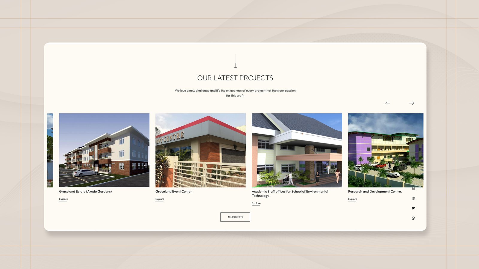
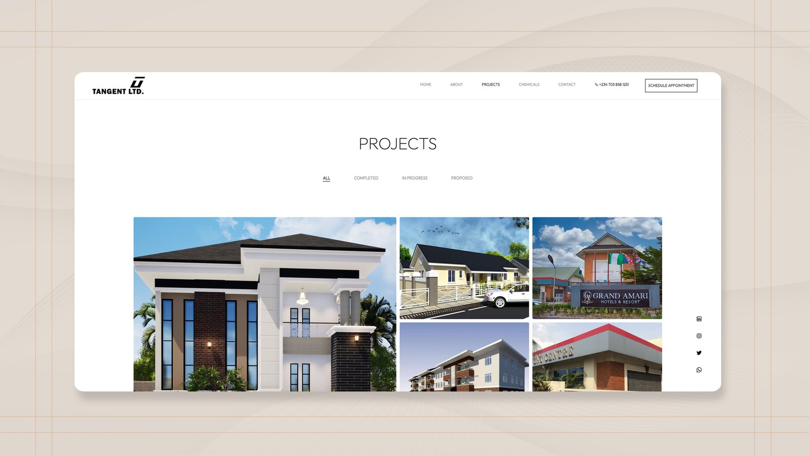
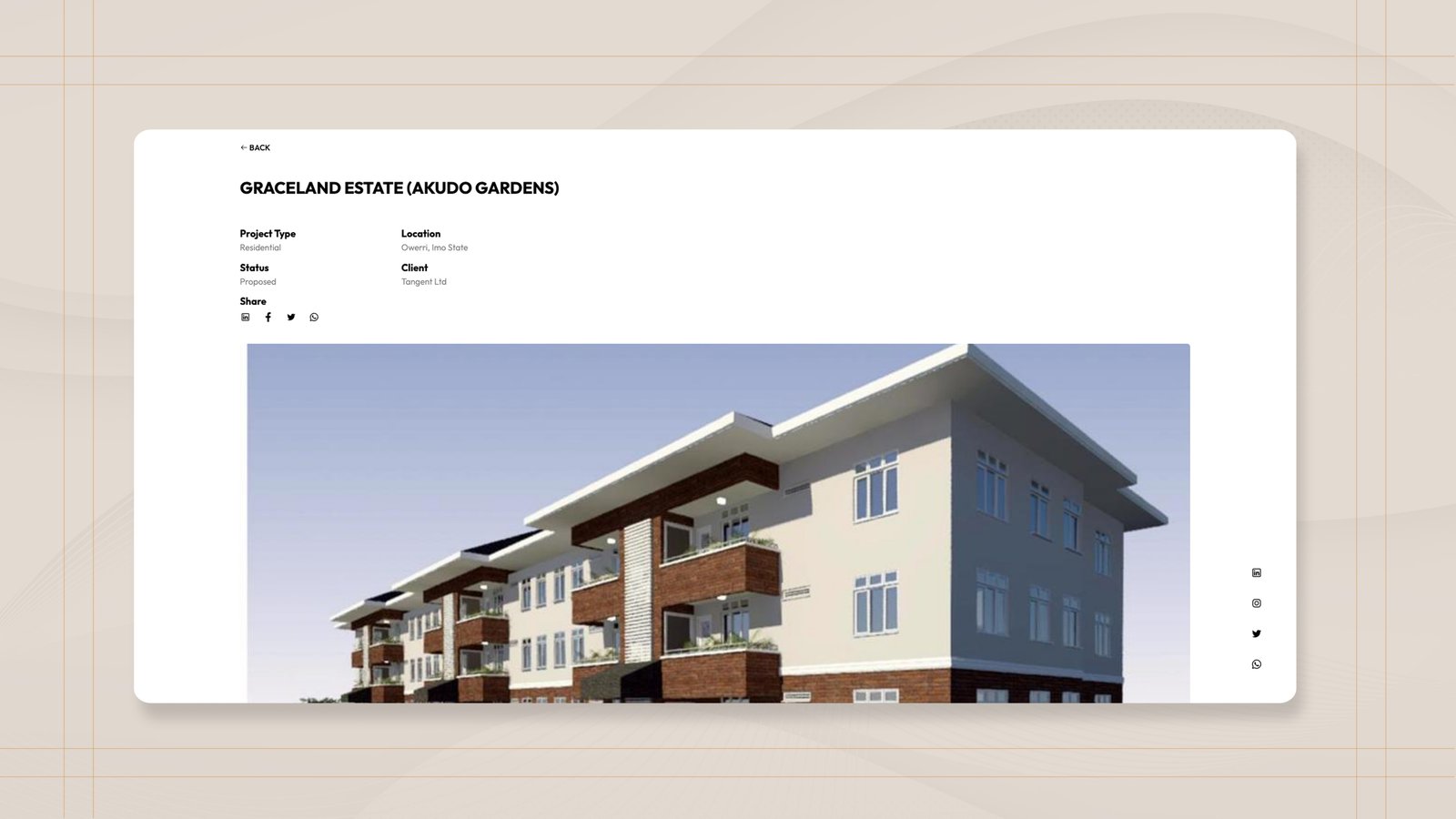
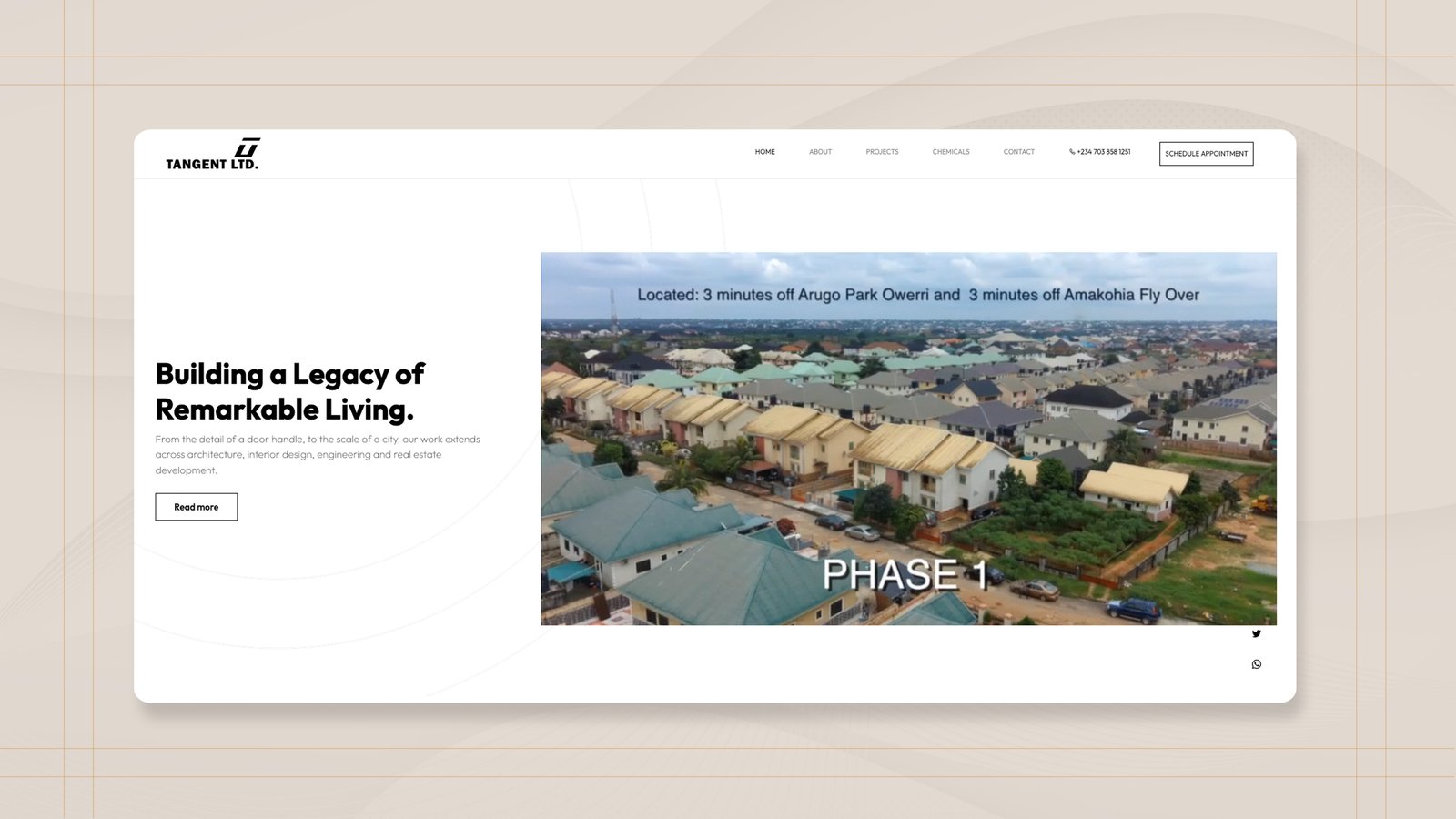
Tangent build for universities, hotel groups and property developers — clients who shortlist a firm long before they ever call one. That vetting was happening with nothing to look at. A practice with that kind of work behind it needed somewhere a procurement officer could see the projects, understand the range, and get in touch without hunting for an address.
Brand
The logo came from the client; everything around it didn't. We set a typeface and a palette and wrote them down as a guide, so the same rules hold whether the next thing is a page, a tender document, or a site hoarding. Restrained on purpose — a practice whose work is concrete and glass doesn't need the site competing with it.
Website
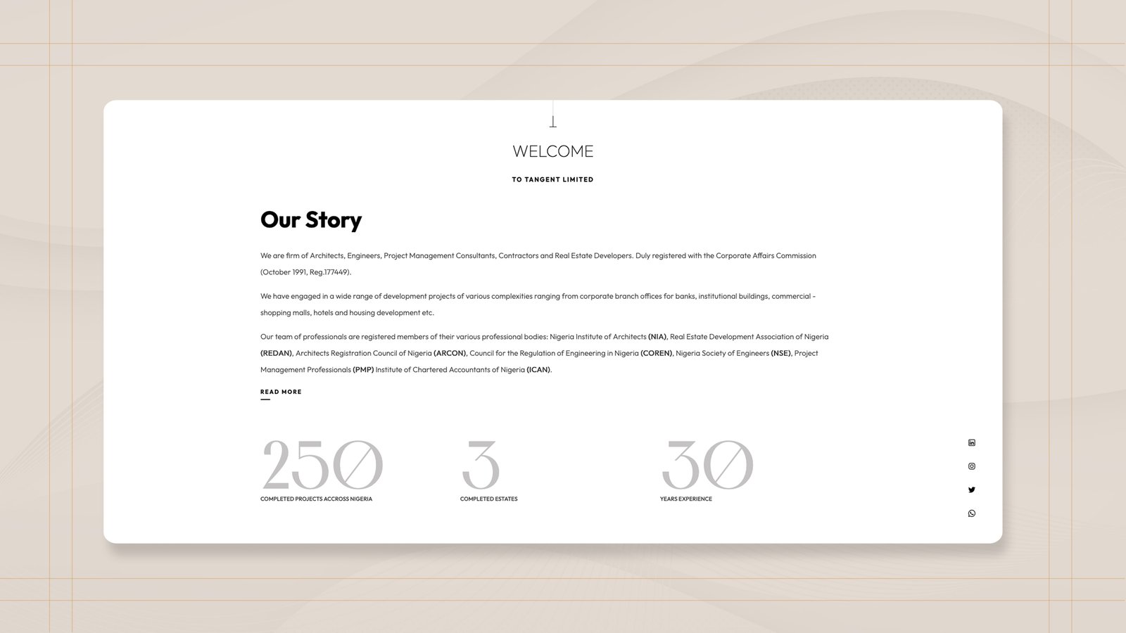
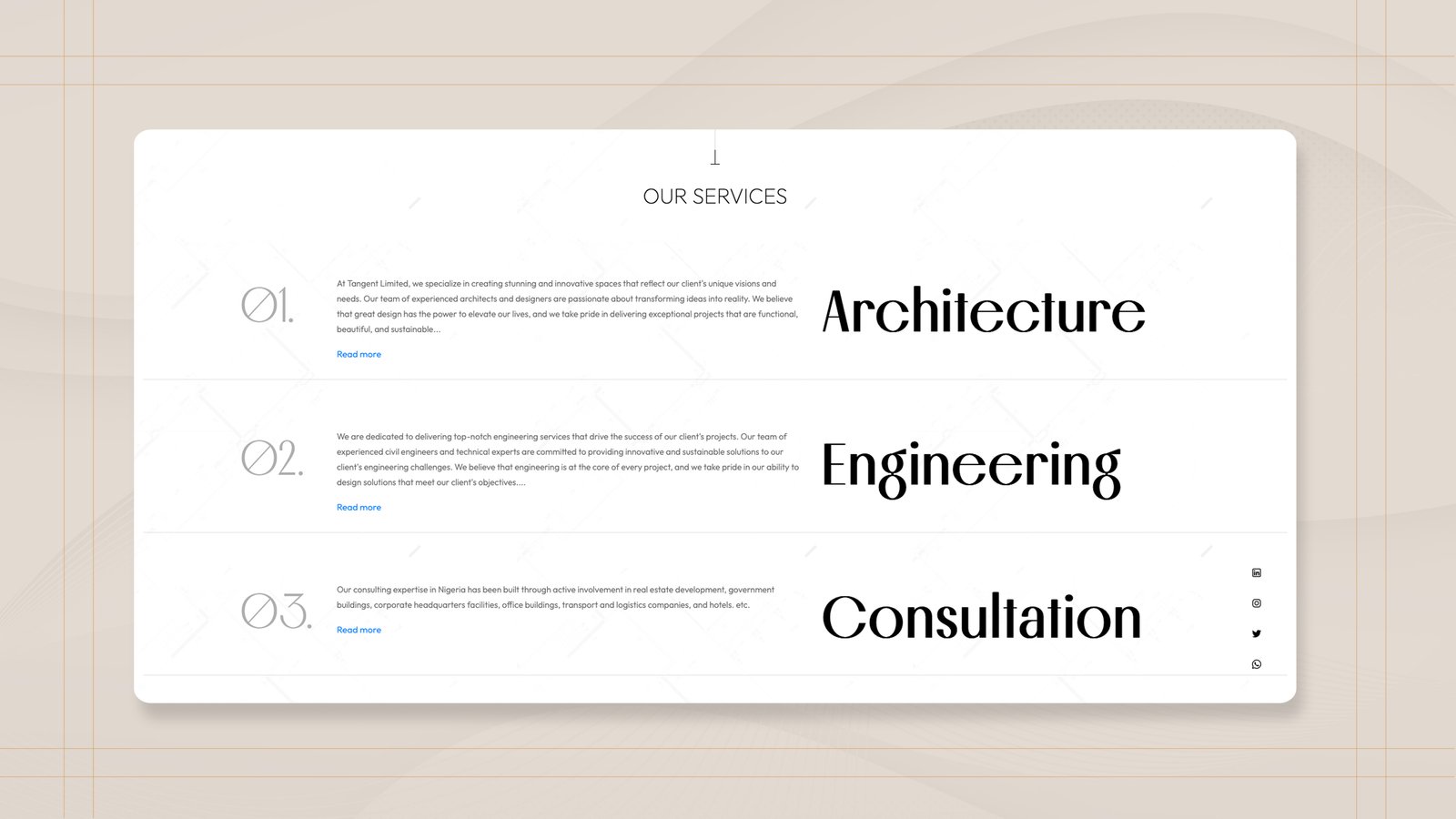
Six things, done plainly: who the firm is, what it does, the projects it has delivered, the questions clients always ask, how to reach them, and a form that starts an enquiry. No carousel, no scroll effects. The work carries the pages and the pages get out of its way.
Outcome
The enquiry form started earning its place. Mail came in about houses on the market, and from prospective clients and others working in the built environment looking for a practice to partner with — people who had found Tangent rather than been introduced to them.